Digital Marketing
I’ve been lucky enough to work with a number of small digital marketing companies across the country. Building their brand identities begins with understanding each agency’s individual mission, values, messaging, and personality. What follows is my favorite part: creating powerful, unique, and visually appealing brands that can be used for years across multiple platforms.

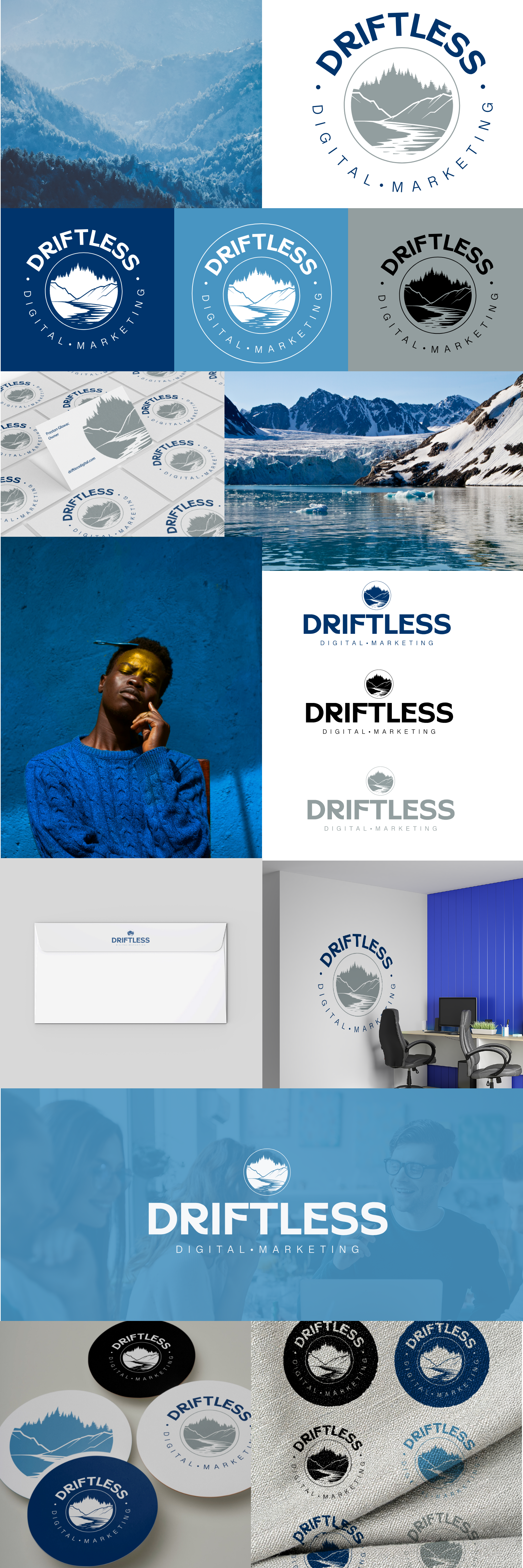
Longtime colleague Preston envisioned a brand that embraced the rolling terrain and deep river valleys of the Driftless landscape in the midwest. His agency positions itself as thoughtful, adaptive, accessible, and intentionally different from one-size-fits-all marketing solutions.

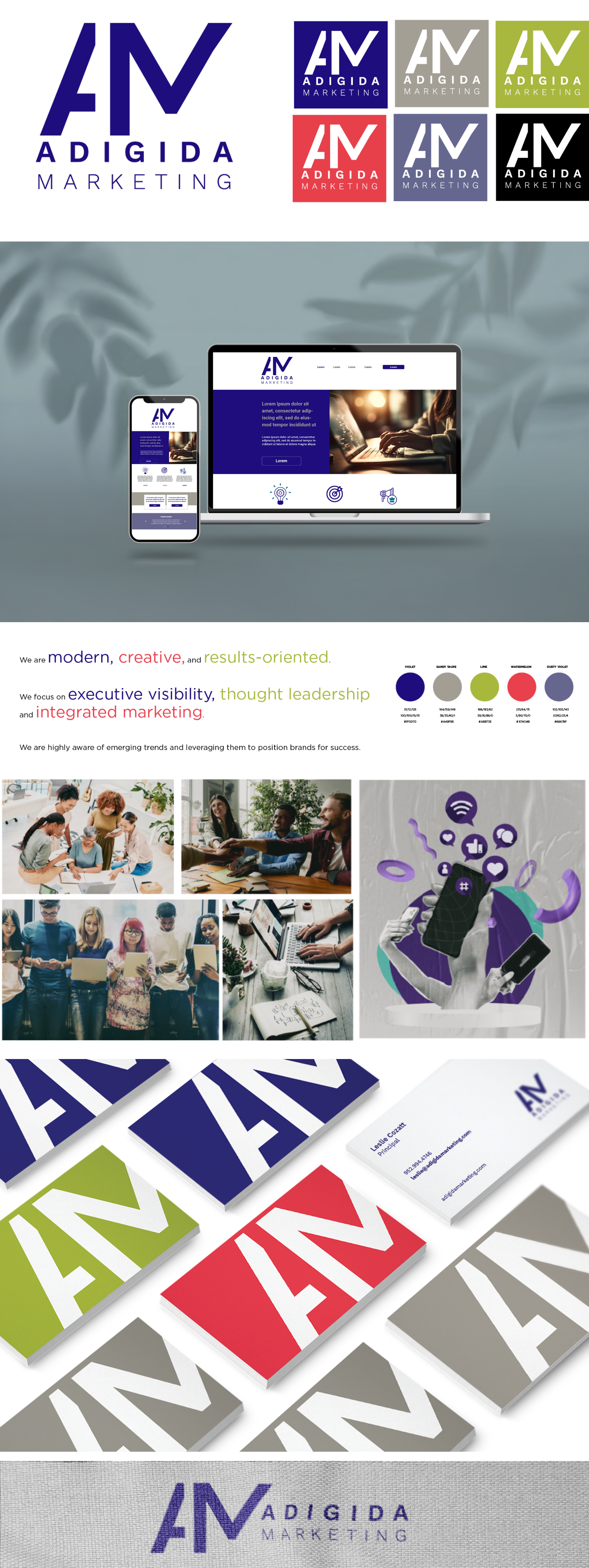
For her company, marketer Leslie wanted a bold, high-impact color scheme to establish a strong visual presence across digital platforms. This minimalist approach avoids unnecessary complexity, allowing the brand to communicate confidence, strategy, and a modern approach.

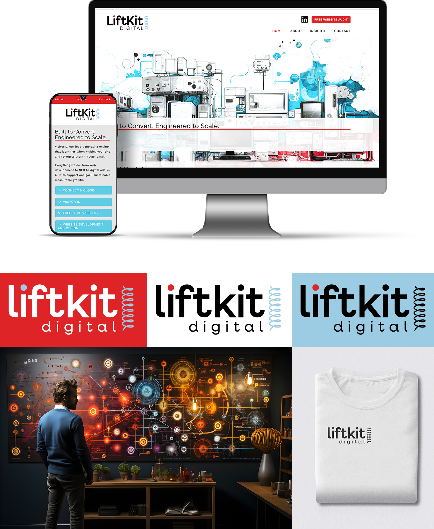
Liftkit Marketing’s brand identity is built around the idea of elevation – raising brands and creating visible momentum. The logo’s icon is both literal and symbolic, representing measurable growth.

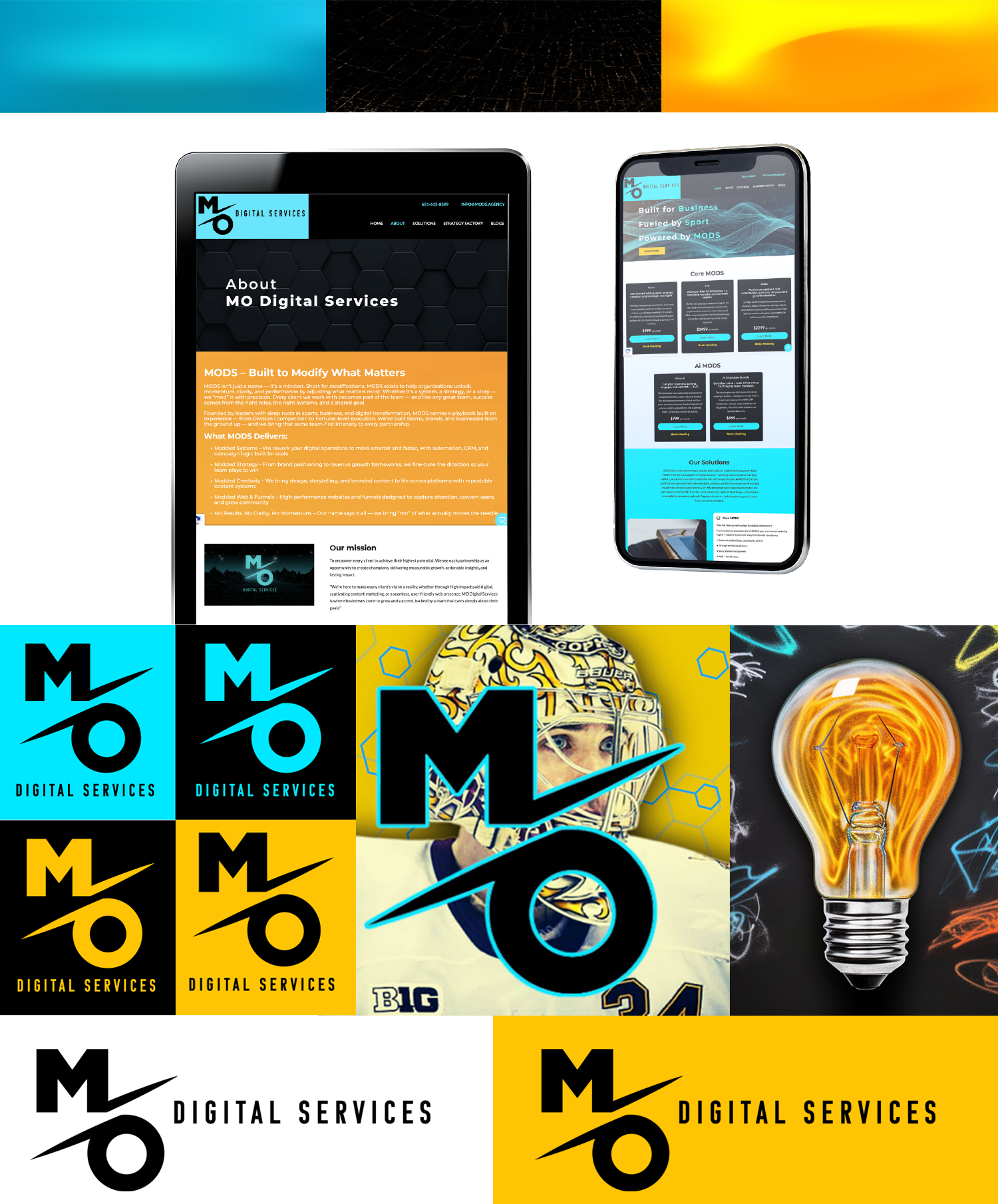
For Nick, founder of MODS, brand positioning was key. As a professional hockey player and coach, he wanted design elements that were sharp and intentional, representing discipline, performance, and relentless focus on results. The agency’s visual language reflects high standards, competitive energy, and a drive to win. The colors are bold and fast and impossible to ignore.
